Schema
Restaurant JSON-LD per location with name, address, phone, hours, and a Series link back to the parent brand for the four pizzerias.
Live Build · Warwickshire
A playful, image-led brand site that frames a 28K-follower pizzeria like a 1960s Italian holiday film, location switcher and all.
This is a real production site we built end-to-end. The build below is the same site you can open at the live URL.
redhotmammapizzeria.vercel.appDesign Language
Concept · Cinema Italia — Riviera Postcards
Palette
Fonts
Signature Moves
Background
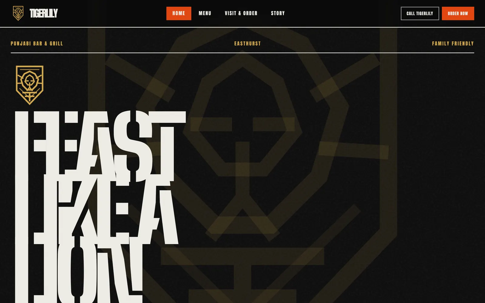
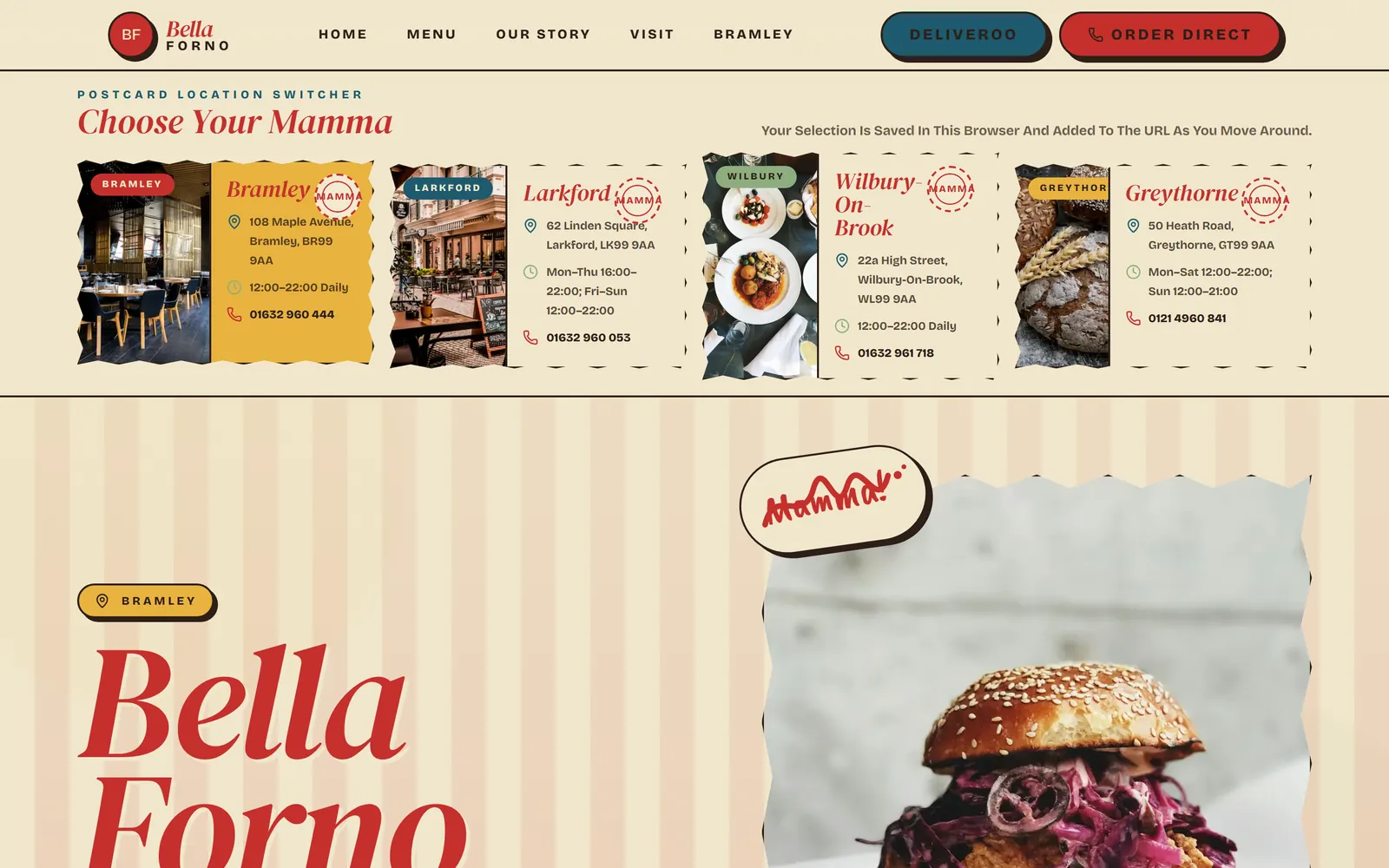
The brief was a four-location Neapolitan pizzeria with 28K Instagram followers and a 4.7 star rating from 1,685 reviews. The brand already had personality — beach huts, alfresco, the Mamma character — so the site had to amplify that into a vintage Italian Riviera holiday film, somewhere between Wes Anderson framing, Hotel Il Pellicano colour, and Pizza Pilgrims swagger.
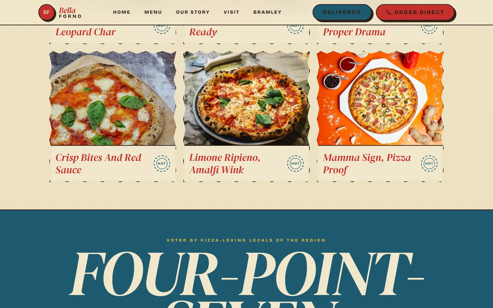
We built a multi-page playful brand site. A postcard location switcher, the RED HOT MAMMA marquee, signature pizzas, the FOUR-POINT-SEVEN moment, story strip, and order CTAs on the homepage; a chaptered menu; and four per-location pages — Leamington, Warwick, Stratford, and Solihull — each with their own hero, address, hours, and a Mamma at sub-title.
Build
The visual system alternates pomodoro red and sun-bleached cream like a Pellicano striped umbrella. Pistachio is the basil-and-menu accent, riviera teal carries the location-switch UI, marigold runs the sun and warmth highlights, and ink brown handles body type. The site never resorts to the red-and-white-checker tablecloth or the literal Italian flag.
Type pairs Editorial New as a vintage condensed serif — italic when the brand speaks as Mamma — with Bricolage Grotesque variable for the warm friendly sans, plus a hand-built Caveat Brush wordmark for the Mamma stamp. Hero headlines run at 120px italic; review numerals use tabular figures so the FOUR-POINT-SEVEN moment lines up cleanly.
Structurally, the homepage opens on a torn-postcard four-location switcher with stamp, address, hours, phone, and a hero image, and the choice persists across the site through a small cookie. The signature pizzas appear in a Wes-Anderson 3×2 grid, all centred and symmetrical with a slow zoom on hover; the passport-stamp story strip carries brand moments framed like inked passport pages; and the order CTAs are chunky retro pill buttons with bouncy hover states for Deliveroo and direct order alike.
What's Wired
Restaurant JSON-LD per location with name, address, phone, hours, and a Series link back to the parent brand for the four pizzerias.
Location switcher is keyboard navigable with visible focus, the marquee respects reduced-motion, and the Wes-Anderson grid carries descriptive alt text on every dish.
Framer Motion handles the marquee and the dish hover only — no carousel arrows, no modals, no lightboxes, and no email pop-ups.
Editorial New display, Bricolage Grotesque variable for body, and a Caveat Brush wordmark for the Mamma stamp.
Pomodoro #C5302C, cream #F1E7CC, pistachio #8DAE7E, riviera teal #1E5A6E, marigold #E8B33F, and ink brown #2D1F18.
Specs
Sister Builds
More builds across other locked directions and locales.
 Live
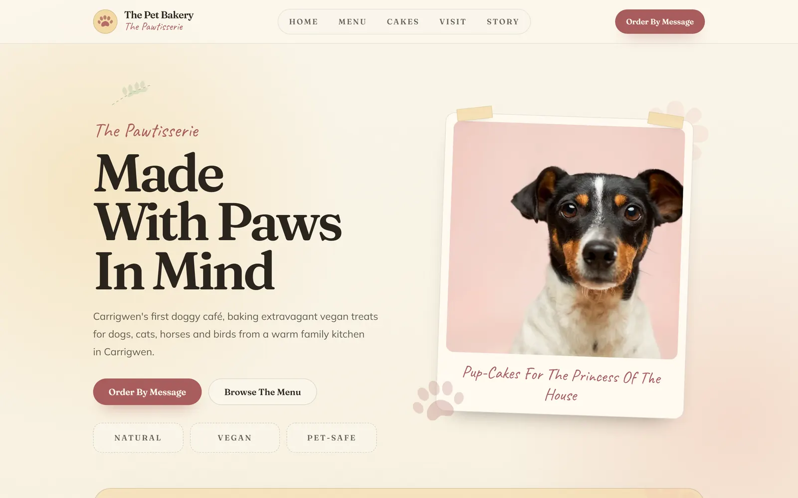
LivePembrokeshire's first doggy café, served on stitched paper.
 Live
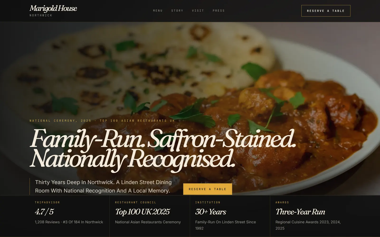
LiveFamily-run. Saffron-stained. Lord-approved.
Start Here
Send the brief with the build that feels closest to your business, and we will reply with the practical package fit.
Cookie Preferences
We use necessary storage to remember this choice. Analytics and marketing stay off unless you say yes.